Ever been in a beauty store or scrolling online and felt drawn to a product even before knowing what it does? Wondered why some packages just grab your attention? It isn’t just about a pretty design; there’s a whole lot of brain science in play. In this post, we’ll take a deep dive into the world of cosmetic wholesale packaging and see how things like colors and shapes mess with our minds and affect our choices.
The Psychology of Beauty Packaging: 5 Ways How Colors and Shapes Influence Consumer Behavior
The Art of First Impressions
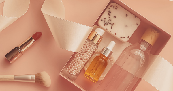
Alright, first things first. How a beauty product is wrapped up can seriously boost or tank its popularity. Think about it – the packaging is what you spot first. It’s like the opening line of a conversation between you and the product, setting up what you might feel about the whole thing. Here’s the breakdown:
Color Psychology: Colors have a profound impact on our emotions and perceptions. Beauty brands are well aware of this fact and use it to their advantage.
- Bold Reds: Red packaging exudes passion, excitement, and confidence. It’s often used for products that aim to make a statement, like vibrant lipsticks or powerful fragrances.
- Cool Blues and Greens: These colors evoke a sense of calm and tranquility. You’ll find them on skincare products, suggesting a gentle, soothing effect.
- Elegant Blacks and Golds: These colors exude luxury and sophistication. High-end brands often use them to convey exclusivity.
- Fresh Whites: White packaging conveys purity and simplicity. It’s commonly seen on products with natural or organic claims.
Shape Matters: Beyond color, the shape of the packaging can communicate a lot. The following shapes are commonly used and have their own unique effects:
- Curves: Round and curvy shapes suggest softness and approachability. They’re often used for products that aim to make you feel comfortable.
- Sharp Angles: Angular shapes convey strength, precision, and edginess. Think of a sleek, modern packaging design.
- Minimalistic: Clean and minimalist designs imply simplicity and functionality. They’re often seen on products that emphasize purity and efficiency.

Creating Emotional Connections
Now that we’ve covered the basics, let’s dive deeper into how these elements create emotional connections between consumers and beauty products.
Building Trust: Trust is a crucial element in the world of beauty. When you see a product with packaging that resonates with you, it triggers positive emotions. You feel a sense of connection and trust towards that product, even if you’ve never tried it before.
Storytelling: Beauty packaging is a silent storyteller. It can convey the essence and purpose of a product without saying a word. For instance, a skincare product in calming blue packaging may subtly hint at its stress-relief properties.
Consistency: Consistent packaging across a brand’s product line fosters brand loyalty. Consumers start recognizing and trusting the brand’s signature colors and shapes. They know what to expect.
The Subtle Art of Persuasion
Packaging isn’t just about aesthetics; it’s a powerful tool of persuasion. Here are some techniques used by beauty brands to sway your decisions:
Limited Editions: Special or limited-edition packaging taps into our fear of missing out (FOMO). These packages are often more ornate or uniquely designed, making them irresistible to collectors and beauty enthusiasts.
Embossing and Textures: The tactile aspect of packaging matters too. Raised patterns, embossed logos, or luxurious textures make a product feel premium and indulgent.
Holographic Effects: Shiny, holographic packaging reflects the light in mesmerizing ways, drawing your attention and creating a sense of wonder. It’s a favorite for products aimed at the younger, trendier crowd.
Transparency: Transparent packaging is all about honesty. It lets you see the product inside, which can build trust. It’s particularly effective for skincare and makeup, as consumers want to know what they’re getting.
The Role of Gender in Packaging
Beauty packaging is also influenced by gender stereotypes and societal norms. While we’re gradually breaking free from these constraints, they still play a role in shaping packaging designs.

Feminine vs. Masculine: Traditionally, feminine packaging often features softer colors, curvier shapes, and floral motifs. Masculine packaging tends to be more angular and use bolder, darker colors. However, these distinctions are becoming less pronounced as brands aim for inclusivity.
Unisex Packaging: Many modern beauty brands are moving towards unisex packaging to cater to a broader audience. These designs often feature neutral colors and minimalist aesthetics.
The Environmental Factor
In recent years, the beauty industry has been under scrutiny for its environmental impact. Packaging waste is a significant concern. As a result, eco-friendly packaging designs are gaining traction. These designs often incorporate recycled materials, minimalistic aesthetics, and refillable containers.
Conclusion: Beauty Beyond the Surface
Beauty packaging isn’t just about the outer glam. It stirs up feelings and paints a picture. It’s a quiet nudge, a tale-spinner, and even shows what’s “in” right now. Knowing the thoughts behind packaging choices helps us align with what feels right. So, the next time you’re drawn to that bold lipstick or calming face cream, remember there’s more to that box or bottle than what’s on the outside. It’s like an adventure, ready to start.


Be the first to reply